Sino
Project Type
Visual Identity
Visual Identity
Date
2020
2020
Location
São Paulo, Brazil
São Paulo, Brazil
Creative Designer
Gustavo Moreira
Gustavo Moreira
This project rethinks the visual identity of SINO, one of Brazil's leading media monitoring companies with over fifty years in the game. The challenge? Taking a visual system stuck in the 90s tech era and turning it into something that actually reflects who they are today: a company that balances innovation with real human understanding.
The new identity is built around three pillars: Human, Simplifying, and Flexible. These aren't just buzzwords; they're what SINO actually does when they turn mountains of data into something that makes sense. Clean typography, fluid compositions, and a color palette that feels calm but precise. Everything here says the same thing: technology that works for people, information that becomes clarity, complexity that turns into trust.
//en
Human Intelligence Behind Data:
Context & Challenge
Context & Challenge
With over five decades in the media monitoring and clipping market, SINO has long been synonymous with trust and credibility.
Over the years, the company built a solid reputation as a reliable partner for major brands, interpreting how the press and social media shape public perception and reputation.
Over the years, the company built a solid reputation as a reliable partner for major brands, interpreting how the press and social media shape public perception and reputation.
When they came to us, however, there was a clear concern.
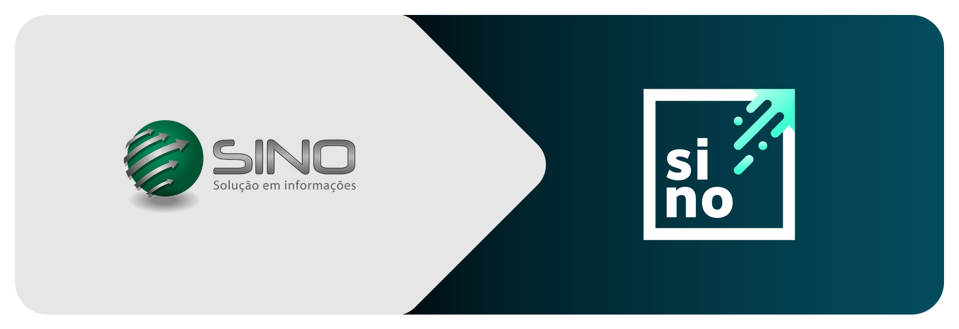
The visual identity no longer represented what SINO had become.
Its logo and graphic elements carried a dated aesthetic (a “90s tech” look) disconnected from the image of a company that now blends cutting-edge technology with human data analysis.
The visual identity no longer represented what SINO had become.
Its logo and graphic elements carried a dated aesthetic (a “90s tech” look) disconnected from the image of a company that now blends cutting-edge technology with human data analysis.
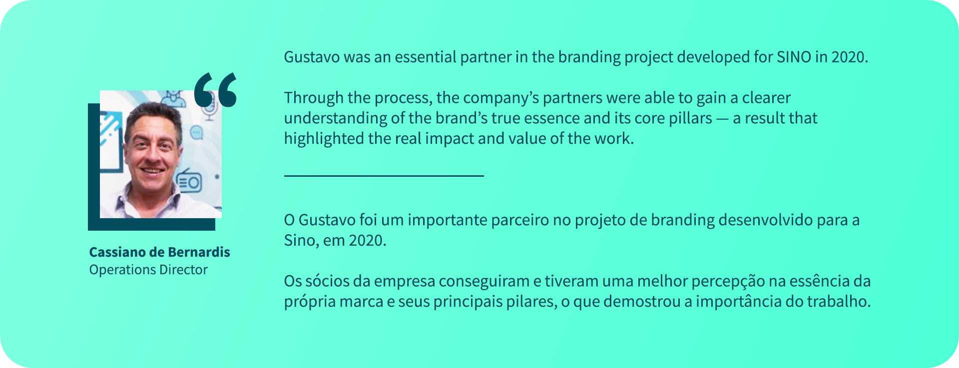
“The challenge was to update perception without erasing history.”
Our role was to lead a strategic rebranding process that could express the brand’s true purpose:
to be the eyes of its clients on the market, delivering accurate, relevant information — interpreted by specialists.
to be the eyes of its clients on the market, delivering accurate, relevant information — interpreted by specialists.
More than modernizing the visuals, the goal was to reposition SINO as a human, tech-driven, and contemporary brand, without losing the institutional weight of a name that has been a reference in its field for over 50 years.
//pt
O olhar humano por trás da informação: Contexto e Desafio
Com mais de cinco décadas de atuação no mercado de clipping e monitoramento, a SINO sempre foi sinônimo de confiança e credibilidade.
Ao longo dos anos, consolidou sua posição como parceira de grandes empresas, responsável por traduzir o que a imprensa e as redes sociais dizem sobre marcas e reputações.
Ao longo dos anos, consolidou sua posição como parceira de grandes empresas, responsável por traduzir o que a imprensa e as redes sociais dizem sobre marcas e reputações.
Mas, quando nos procuraram, havia um incômodo claro.
A identidade visual já não representava a empresa que a SINO havia se tornado.
O logotipo e os elementos gráficos traziam uma estética datada (uma visão de tecnologia dos anos 90), distante da imagem de uma organização que hoje combina tecnologia de ponta e análise humana de dados.
A identidade visual já não representava a empresa que a SINO havia se tornado.
O logotipo e os elementos gráficos traziam uma estética datada (uma visão de tecnologia dos anos 90), distante da imagem de uma organização que hoje combina tecnologia de ponta e análise humana de dados.
“O desafio era atualizar a percepção sem apagar a história.”
Nosso papel foi conduzir um processo de rebranding estratégico, capaz de traduzir o verdadeiro propósito da marca:
ser os olhos de seus clientes sobre o mercado, entregando informação precisa, relevante e interpretada por especialistas.
ser os olhos de seus clientes sobre o mercado, entregando informação precisa, relevante e interpretada por especialistas.
Mais do que modernizar o visual, o desafio era reposicionar a SINO como uma marca humana, tecnológica e contemporânea, sem perder o peso institucional de quem é referência no setor há mais de 50 anos.

//en
Strategy & Creative Process
We began with an in-depth brand DNA immersion, conducting interviews and perception exercises.
From that process, three key attributes emerged — the foundation of the entire brand strategy:
From that process, three key attributes emerged — the foundation of the entire brand strategy:
Human. Simplifying. Flexible.
These three pillars guided every decision in design, tone of voice, and visual expression.
“When you work with SINO, you’re not signing a contract with robots, you’re working with professionals who know how to get the best out of technology.”
During the competitive analysis, we noticed how the industry had fallen into a predictable visual pattern:
orange tones, slab serif fonts, and rigid icons that felt outdated in their idea of “innovation.”
Our mission was to break from that formula — crafting a brand that felt fluid, current, and truly in tune with the present.
orange tones, slab serif fonts, and rigid icons that felt outdated in their idea of “innovation.”
Our mission was to break from that formula — crafting a brand that felt fluid, current, and truly in tune with the present.
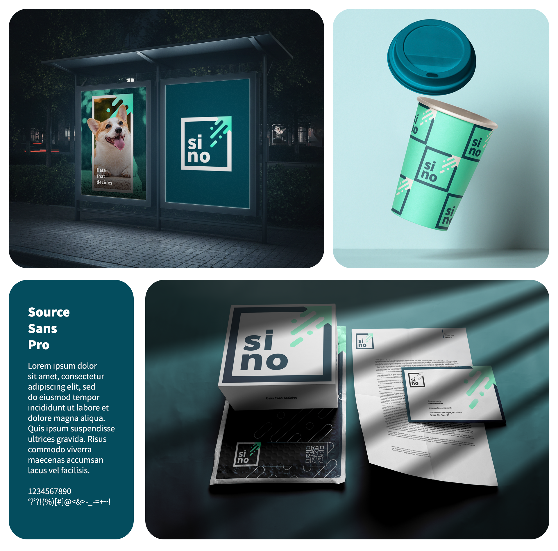
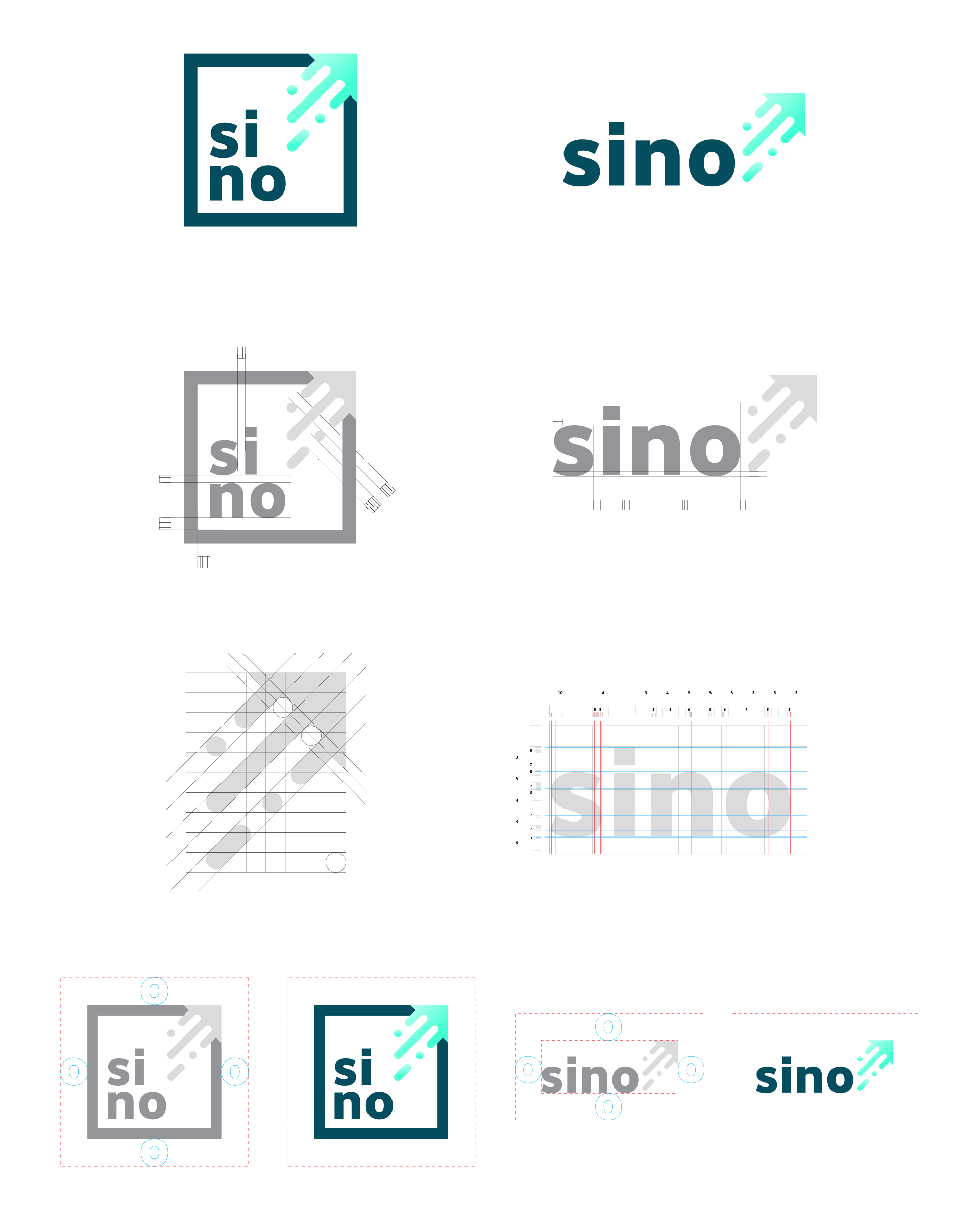
The chosen typography conveys lightness and clarity, reinforcing the Simplifying attribute.
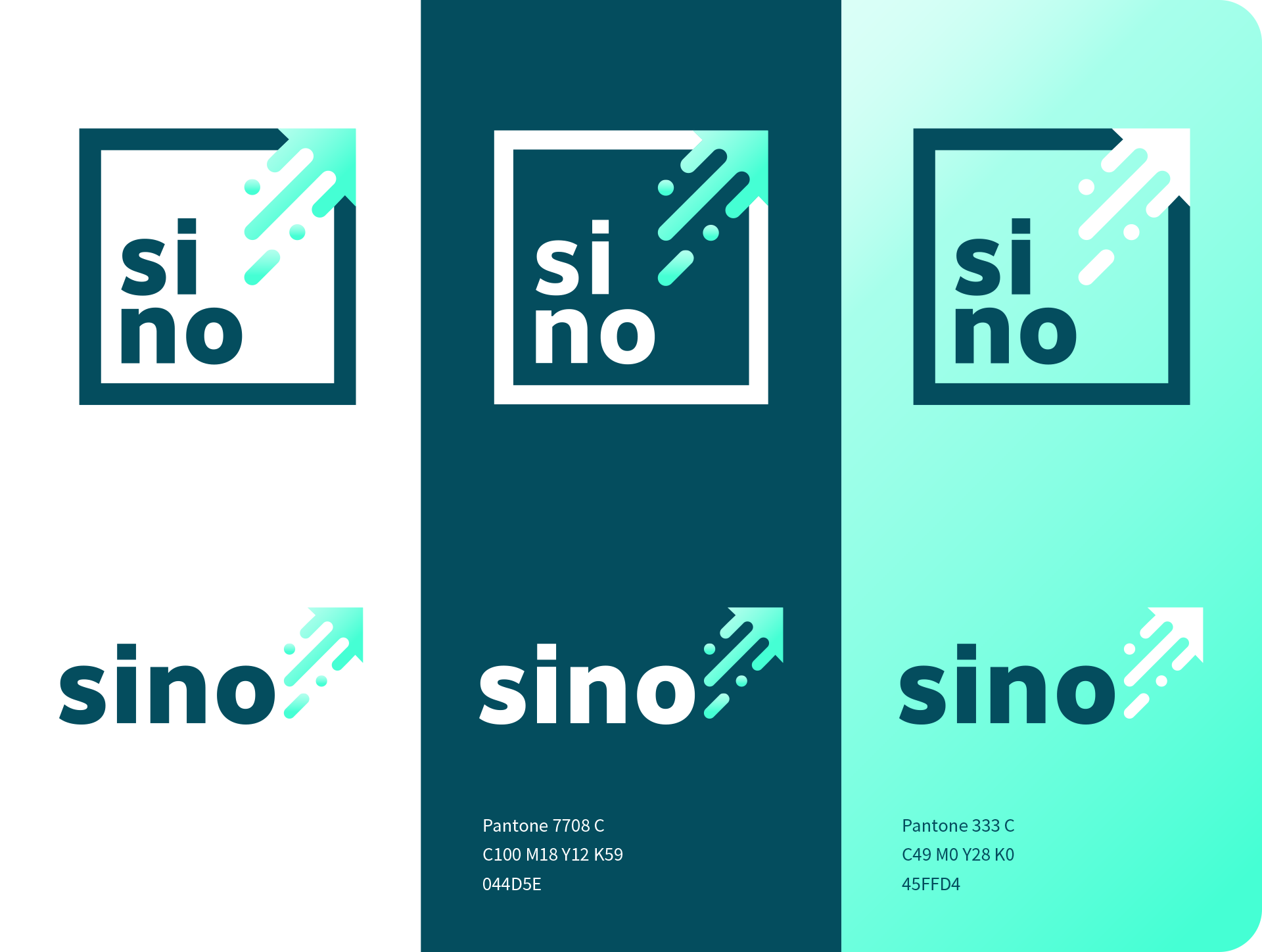
Colors and forms were designed to evoke trust and modernity, avoiding any association with the conventional “corporate tech” look.
The photographic direction brings the focus back to people — a reminder that information only gains meaning through a human lens.
Colors and forms were designed to evoke trust and modernity, avoiding any association with the conventional “corporate tech” look.
The photographic direction brings the focus back to people — a reminder that information only gains meaning through a human lens.
The result is a flexible visual system that adapts to different contexts while maintaining coherence — a brand ready for the future, yet grounded in its core values.
//pt
Estratégia e Processo Criativo
Iniciamos o trabalho com um mergulho no DNA de marca, conduzindo entrevistas e dinâmicas de percepção.
Dessa imersão, emergiram três atributos que definiram toda a estratégia de branding:
Dessa imersão, emergiram três atributos que definiram toda a estratégia de branding:
Humana. Simplificadora. Flexível.
Esses três pilares passaram a ser o alicerce das decisões de design, tom de voz e expressão visual.
“Quem contrata a SINO, não está assinando contrato com robôs e sim com profissionais que sabem tirar o melhor da tecnologia.”
Durante a análise competitiva, percebemos que o setor de clipping havia cristalizado um padrão visual:
tons alaranjados, tipografias slab e ícones duros que remetiam a uma ideia ultrapassada de inovação.
Nossa missão era romper com esse padrão, construindo uma marca mais fluida, atual e conectada com o presente.
tons alaranjados, tipografias slab e ícones duros que remetiam a uma ideia ultrapassada de inovação.
Nossa missão era romper com esse padrão, construindo uma marca mais fluida, atual e conectada com o presente.
A tipografia escolhida traz leveza e clareza, reforçando o atributo Simplificadora.
As cores e formas foram definidas para transmitir confiança e atualização, evitando qualquer associação com o “tecno corporativo” tradicional.
A fotografia, por sua vez, aproxima a marca das pessoas — lembrando que a informação só ganha sentido quando passa por um olhar humano.
As cores e formas foram definidas para transmitir confiança e atualização, evitando qualquer associação com o “tecno corporativo” tradicional.
A fotografia, por sua vez, aproxima a marca das pessoas — lembrando que a informação só ganha sentido quando passa por um olhar humano.
O resultado é um sistema visual flexível, que se adapta a diferentes contextos sem perder coerência.
Uma marca preparada para o futuro, mas enraizada em valores sólidos.
Uma marca preparada para o futuro, mas enraizada em valores sólidos.
//en
Solution & Results
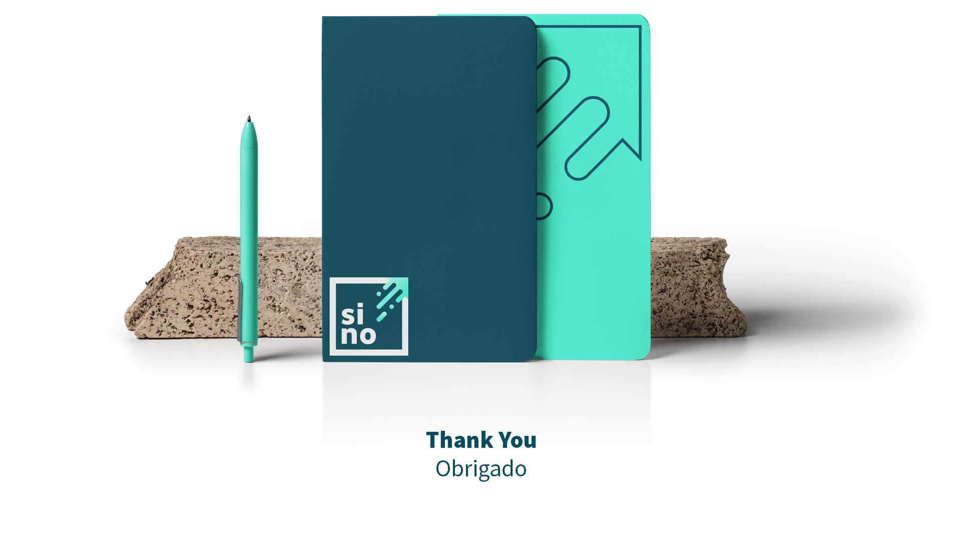
The new SINO identity system materializes the balance between innovation and humanity.
It now communicates what has always been part of the company’s DNA:
using technology to simplify clients’ lives and transform data into strategic decisions.
It now communicates what has always been part of the company’s DNA:
using technology to simplify clients’ lives and transform data into strategic decisions.
“The new brand makes visible what was always behind the scenes: information with purpose.”
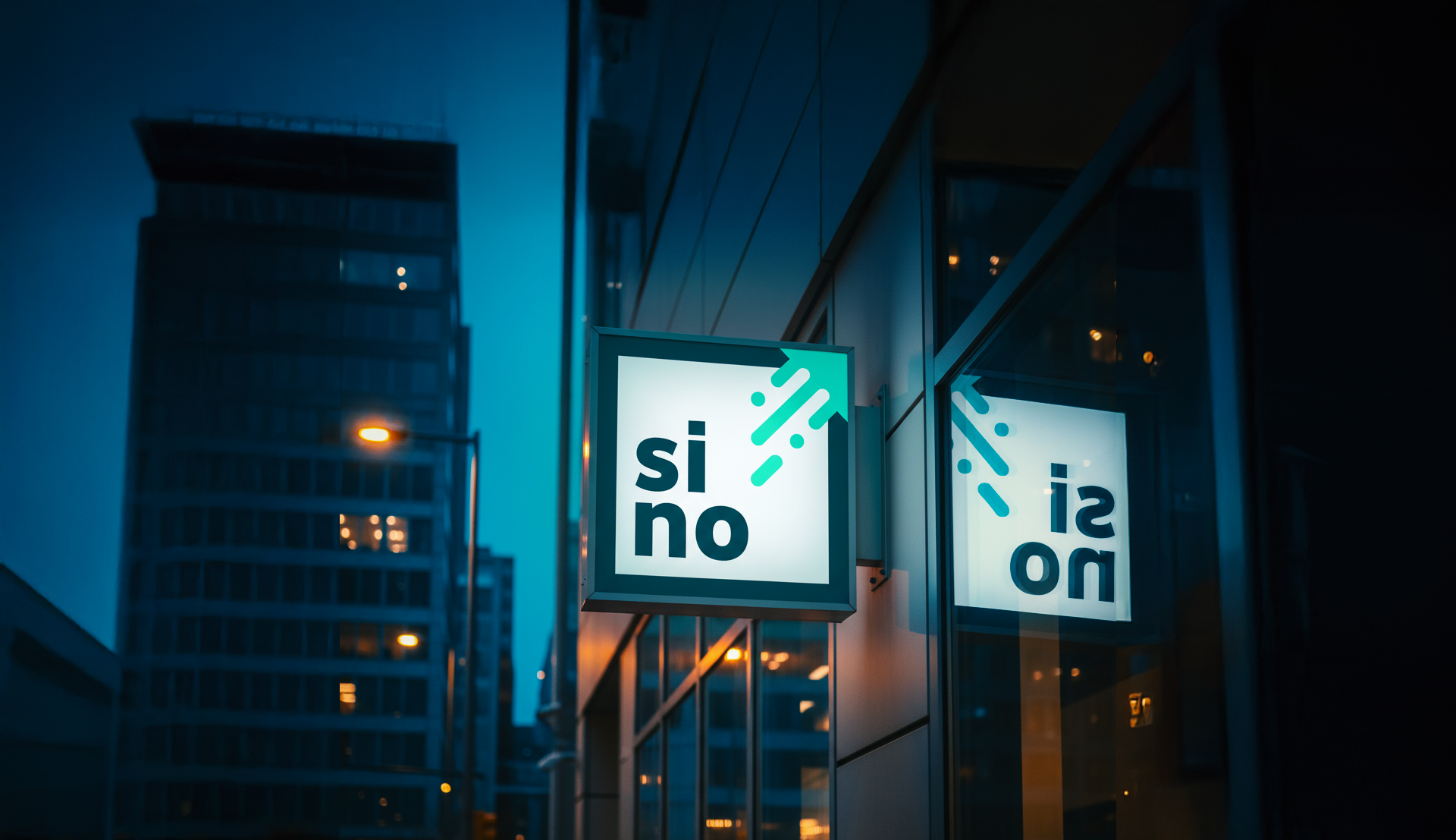
The visual language became lighter, sharper, and more expansive reflecting the way SINO operates:
simplifying access to information and empowering better decision-making.
simplifying access to information and empowering better decision-making.
The project was approved on the first presentation.
Leadership immediately recognized in the new design the embodiment of what SINO has always believed: that real value lies not just in data, but in those who know how to interpret it.
Leadership immediately recognized in the new design the embodiment of what SINO has always believed: that real value lies not just in data, but in those who know how to interpret it.
The rebranding marked the start of a new chapter for the brand,
one where technology and sensibility coexist to create meaningful impact.
one where technology and sensibility coexist to create meaningful impact.
//pt
Solução e Resultados
O novo sistema de identidade da SINO traduz de forma tangível o equilíbrio entre inovação e humanidade.
A marca comunica hoje o que sempre foi parte de sua cultura:
usar tecnologia para simplificar a vida dos clientes e transformar dados em decisões estratégicas.
A marca comunica hoje o que sempre foi parte de sua cultura:
usar tecnologia para simplificar a vida dos clientes e transformar dados em decisões estratégicas.
“A nova marca tangibiliza o que sempre esteve nos bastidores: informação com propósito.”
A linguagem visual se tornou mais leve, precisa e expansiva, refletindo o modo como a SINO atua simplificando o acesso à informação e fortalecendo a tomada de decisão dos seus clientes.
A aprovação veio de primeira.
A diretoria reconheceu no novo design a materialização do que a SINO sempre acreditou: que o verdadeiro valor não está apenas nos números, mas em quem sabe interpretá-los.
A diretoria reconheceu no novo design a materialização do que a SINO sempre acreditou: que o verdadeiro valor não está apenas nos números, mas em quem sabe interpretá-los.
O rebranding marcou um novo capítulo para a marca,
um capítulo em que tecnologia e sensibilidade coexistem para gerar impacto real.
um capítulo em que tecnologia e sensibilidade coexistem para gerar impacto real.