CESIN
Project Type
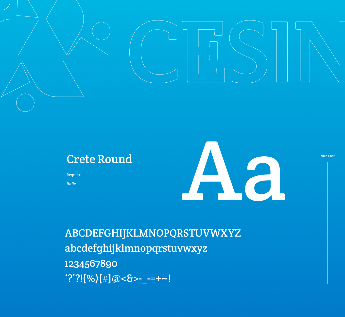
Branding, Art Direction, Motion, Digital
Branding, Art Direction, Motion, Digital
Date
2015
2015
Location
Belém, Brazil
Team
Creative Designer: Gustavo Moreira
Illustration: Carol Coroa
Motion: Felipe Chamma
Photography: Victor Estácio
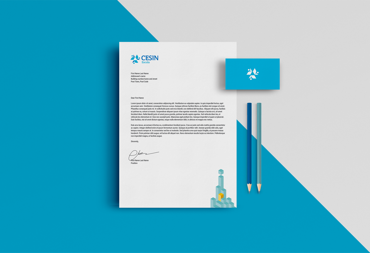
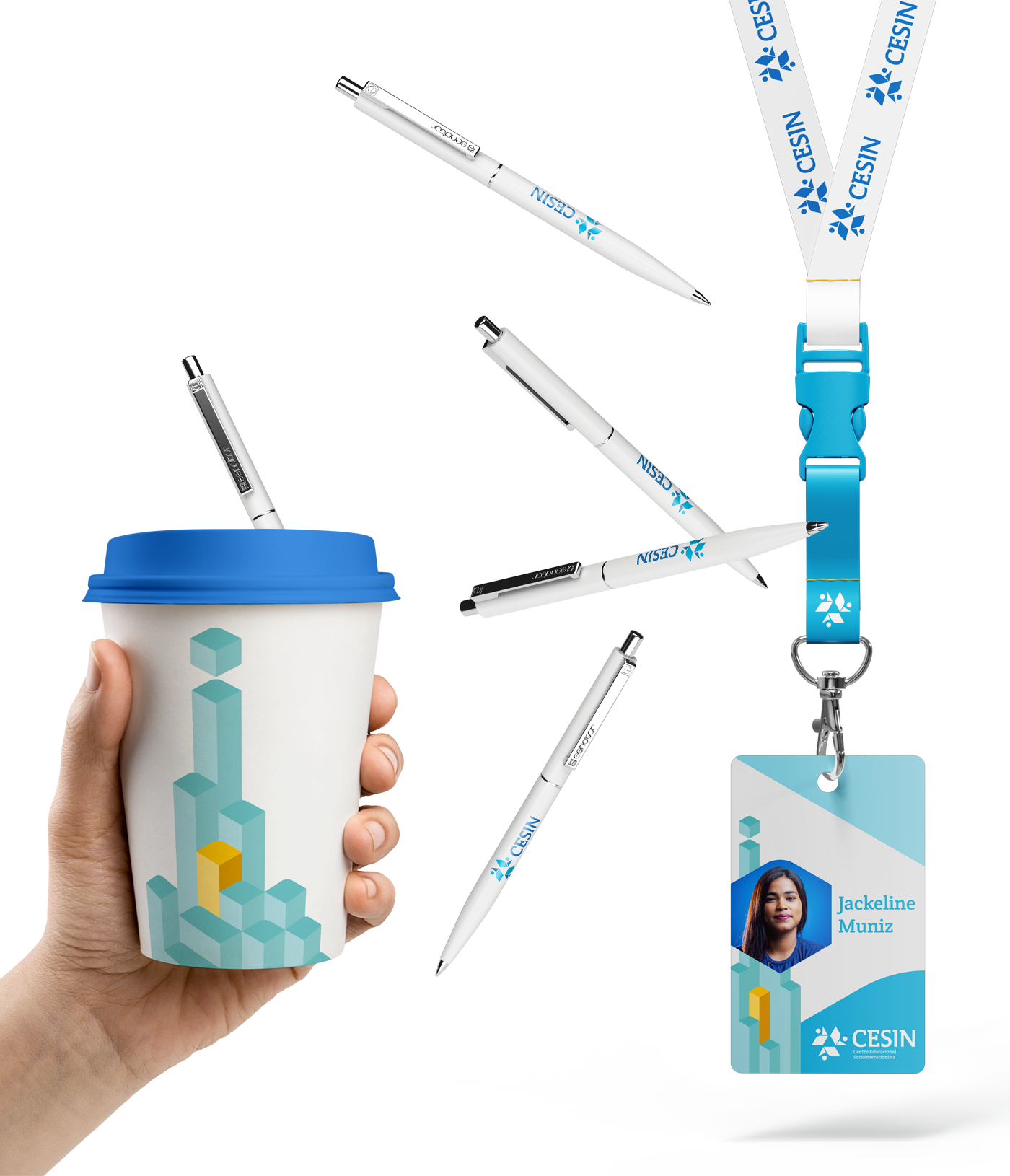
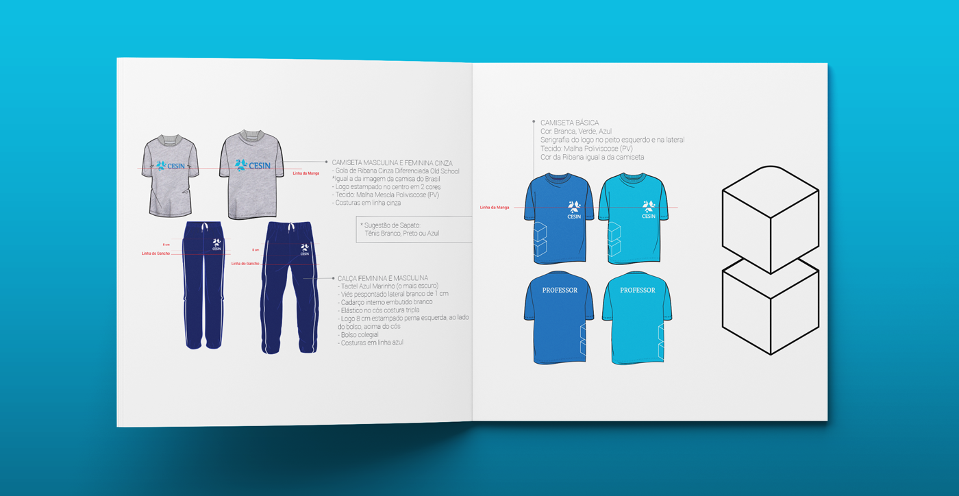
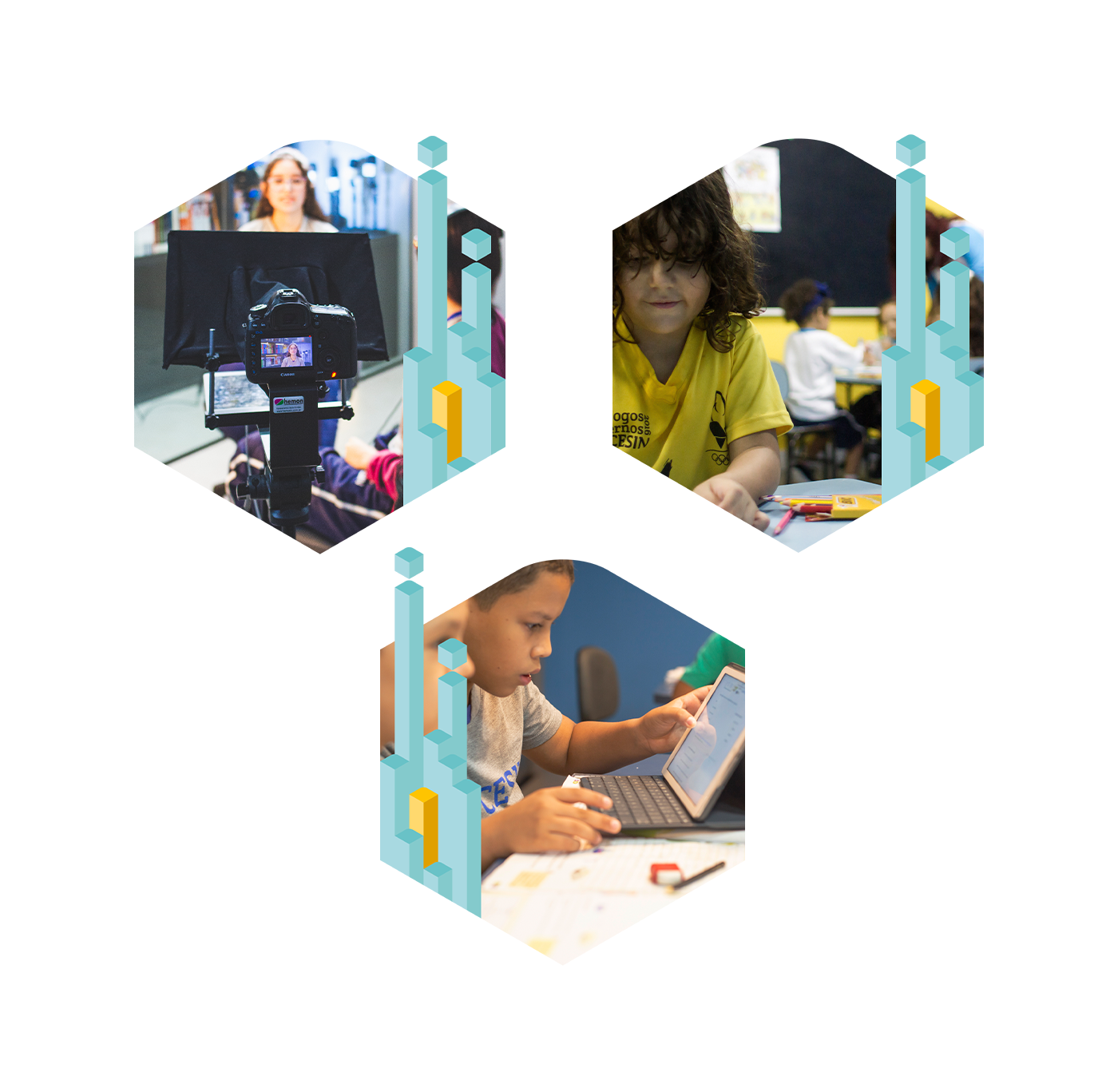
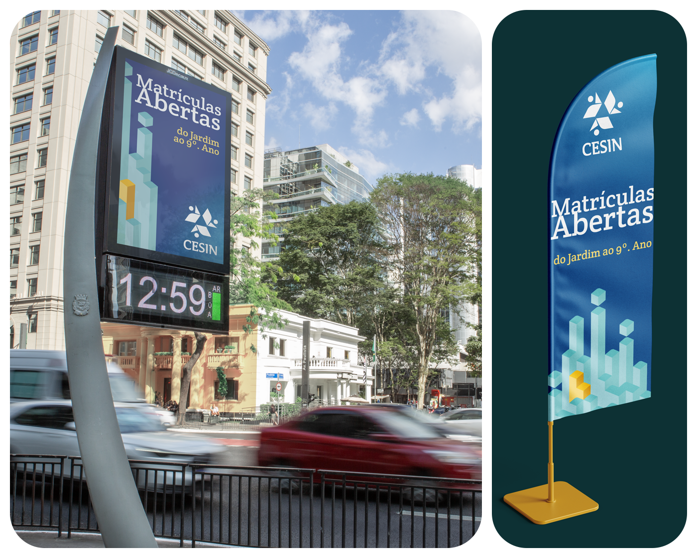
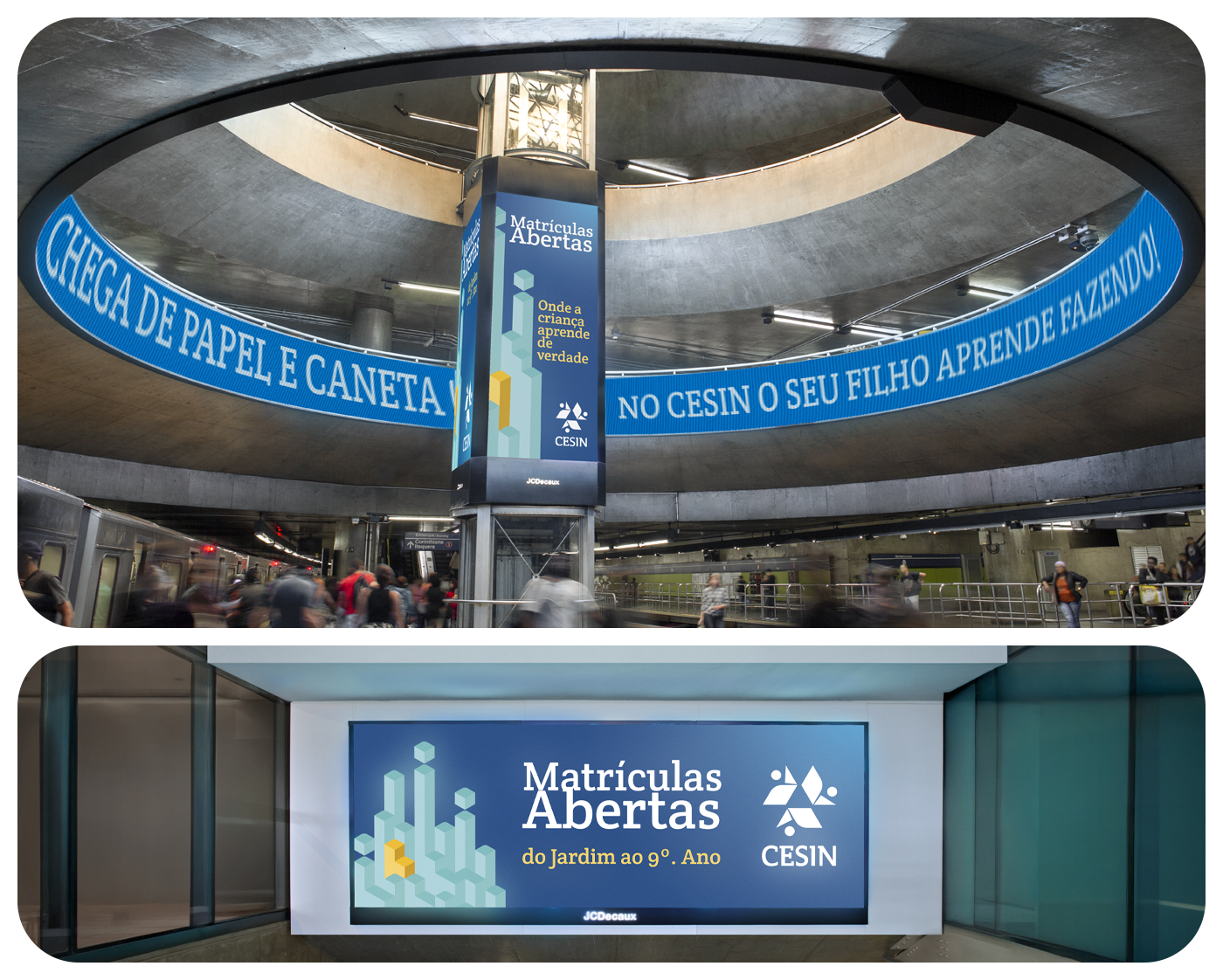
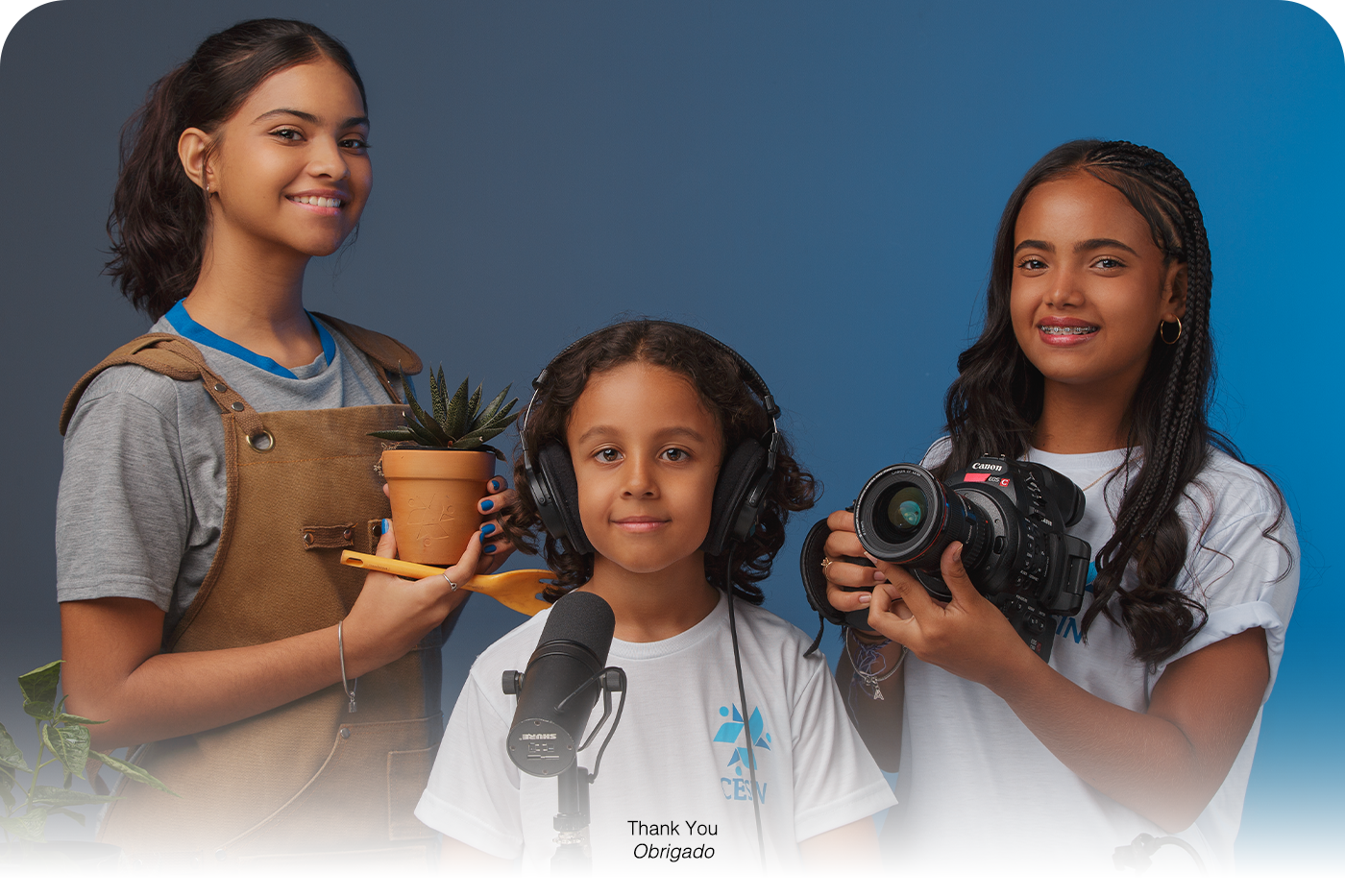
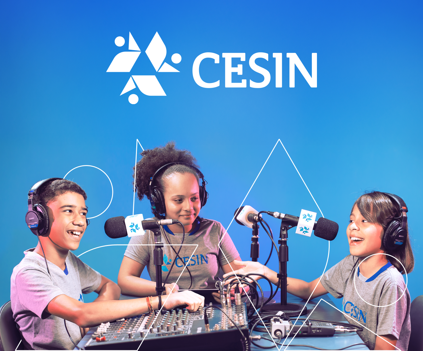
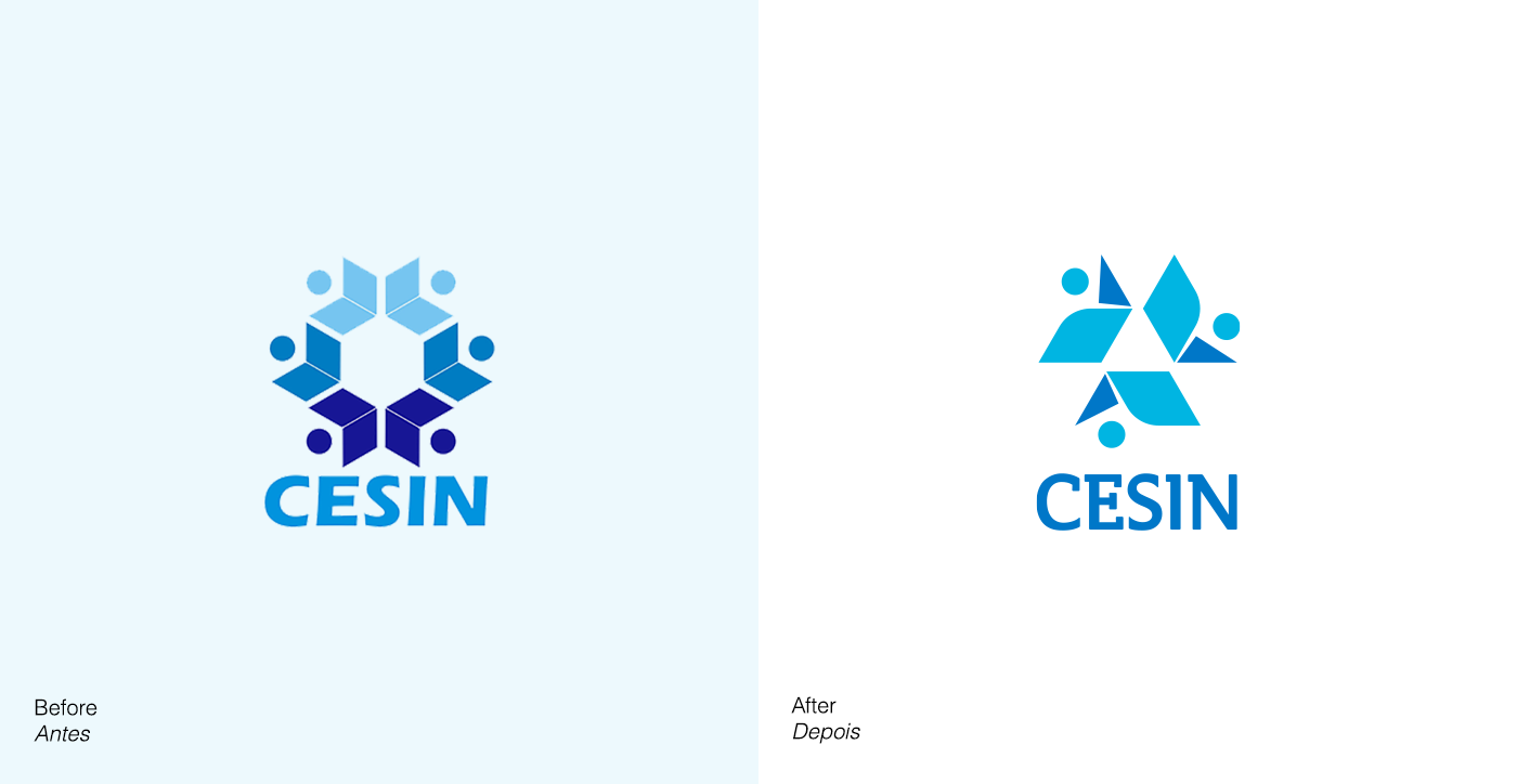
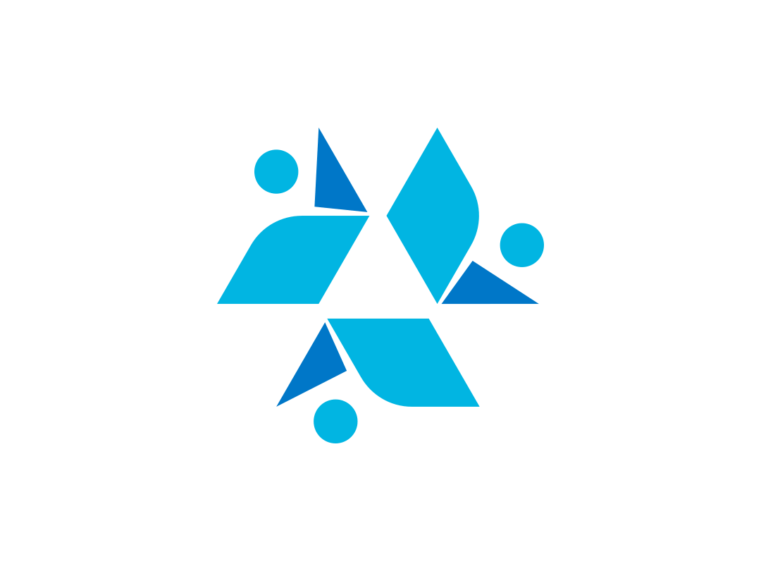
This project reimagines the visual identity of CESIN, a school rooted in Vygotskian pedagogy and known for its close-knit, community-driven approach to education. The challenge was to refine an amateur visual system into a cohesive, meaningful identity, one that could reflect CESIN’s dynamic, human-centered values without losing the emotional connection families had built over decades. Through geometric forms, warm colors, and an emphasis on motion and interaction, the new identity captures the school’s commitment to nurturing relationships, autonomy, and real-world learning across every age group.
//En
Humanizing CESIN:
a visual identity for a school
that grows together
a visual identity for a school
that grows together
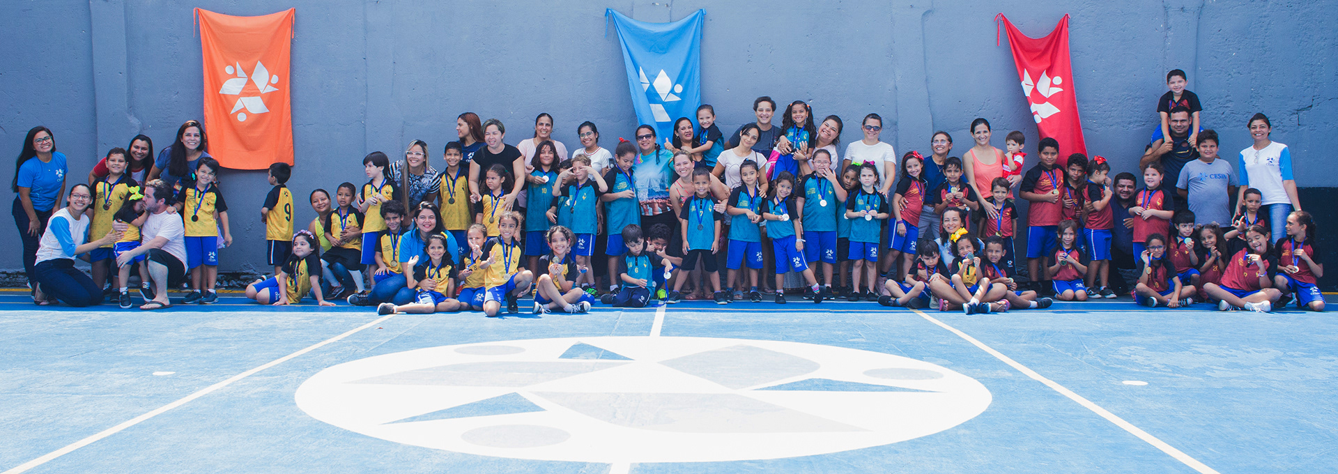
CESIN, an educational center with over 20 years of history, set out to visually express what already happens daily in its classrooms: authentic human relationships, shared learning, and a school that honors each child's pace, story, and potential.
Rather than simply designing a new logo, the challenge was to reveal visually what has long existed in CESIN’s hallways, learning circles, and hands-on projects. CESIN isn’t a mass education center, it’s a community that evolves with every discovery. The brand had to reflect the care, simplicity, and autonomy at the heart of its pedagogical vision.
This project shows how design can embody an educational philosophy. Fostering belonging, strengthening bonds, and making visible what was once only felt.
//Pt
Humanizando o CESIN:
uma identidade para quem
aprende junto
uma identidade para quem
aprende junto
O CESIN, um centro educacional com mais de 20 anos de história, buscava traduzir em imagem aquilo que já acontece todos os dias em suas salas de aula: relações humanas genuínas, aprendizagem construída em conjunto e uma escola que respeita o tempo, a história e o potencial de cada criança.
Mais do que criar uma nova marca, o desafio era revelar visualmente aquilo que já estava presente nos corredores, nas rodas de conversa e nos projetos vivenciais. O CESIN não é uma escola de massa, é uma comunidade que cresce com cada descoberta. Por isso, a identidade precisava refletir o afeto, a simplicidade e a autonomia que atravessam sua proposta pedagógica.
Esse projeto mostra como o design pode ser uma extensão da filosofia educacional. Criando pertencimento, fortalecendo vínculos e tornando visível o que antes só se sentia.


//En
Challenges
Redesigning CESIN’s brand was, above all, an exercise in listening and sensitivity.
The main challenge was to refresh this identity without losing the emotional bond the community already had with it. CESIN is deeply rooted in the lives of many local families, so the rebrand needed to be both respectful and bold enough to introduce a new chapter. We wanted everyone, parents, teachers, students, and staff, to see themselves in this evolution.
There was also a visual positioning challenge: how do we communicate the school’s high-quality education and welcoming approach without appearing too distant or upscale? Since the school is located in an area further from the city center, we chose a design language that feels warm, approachable, and intentional at the same time.
What I took away from this project goes beyond logo design. This was my first time working with an educational institution that nurtures such an active, living community, where the leadership stays close to families all year round. That changes everything. In this context, a brand isn’t just a symbol or a color palette, it’s also about relationships. And that taught me that visual identity isn’t a one-off deliverable. It’s something alive. And taking care of something alive means staying close, staying involved, and always coming back to its purpose.
//Pt
Desafios
Redesenhar a marca do CESIN foi, antes de tudo, um exercício de escuta e sensibilidade.
O grande desafio foi atualizar essa imagem sem quebrar o vínculo afetivo que a comunidade já tinha com a marca antiga. O CESIN é uma escola presente na vida de muitas famílias da região, então essa transição precisava ser cuidadosa, respeitosa e, ao mesmo tempo, capaz de abrir espaço para novos significados. A ideia era que todos, pais, professores, alunos e colaboradores, se reconhecessem nessa nova fase.
Também havia um ponto importante relacionado à estética: como traduzir a qualidade do ensino e o acolhimento da proposta pedagógica sem parecer distante demais? A escola está localizada em uma área mais afastada do centro, e por isso optamos por uma comunicação acessível, leve, mas ainda assim cheia de intenção.
O maior aprendizado desse projeto não veio só do design da marca, mas da vivência com uma escola que tem uma comunidade pulsante. Foi a primeira vez que trabalhei com uma instituição educacional onde os diretores mantêm contato direto com as famílias ao longo de todo o ano. Isso muda tudo. A marca, nesse caso, não é só símbolo ou cor, é também relacionamento. E entender isso me ensinou que cuidar de uma identidade visual é um compromisso contínuo, especialmente quando ela vive em tantas mãos diferentes. Uma marca viva precisa de atenção constante, presença e propósito.